Let’s Make Festive Happen:
BCLIQUOR’s Holiday 2022 Campaign
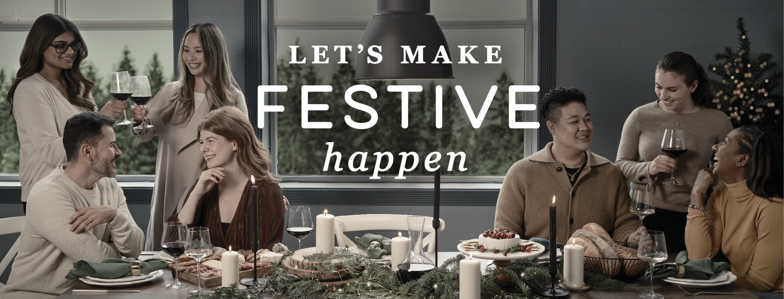
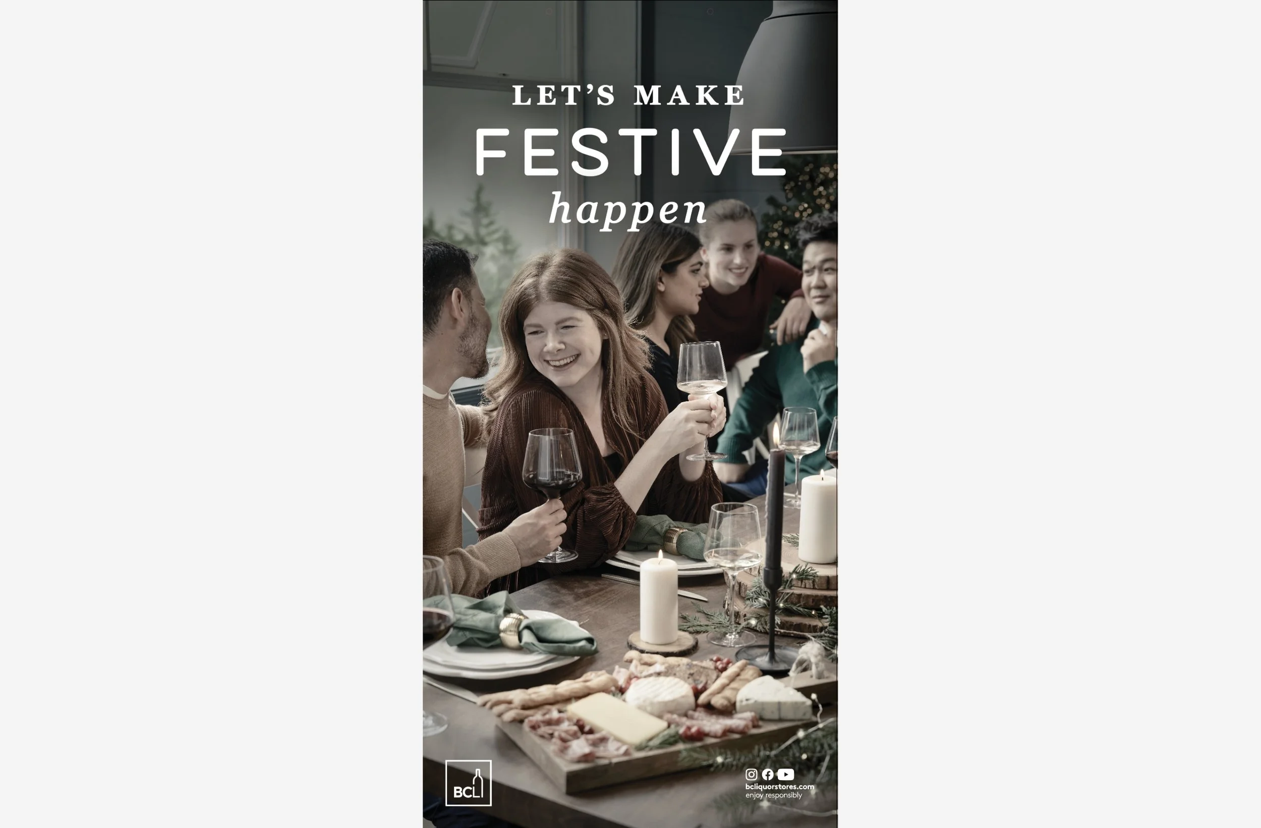
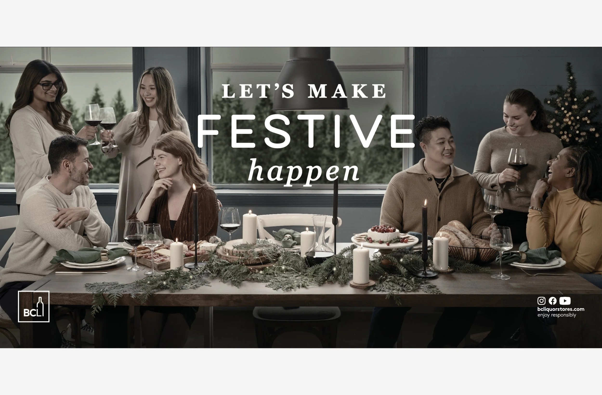
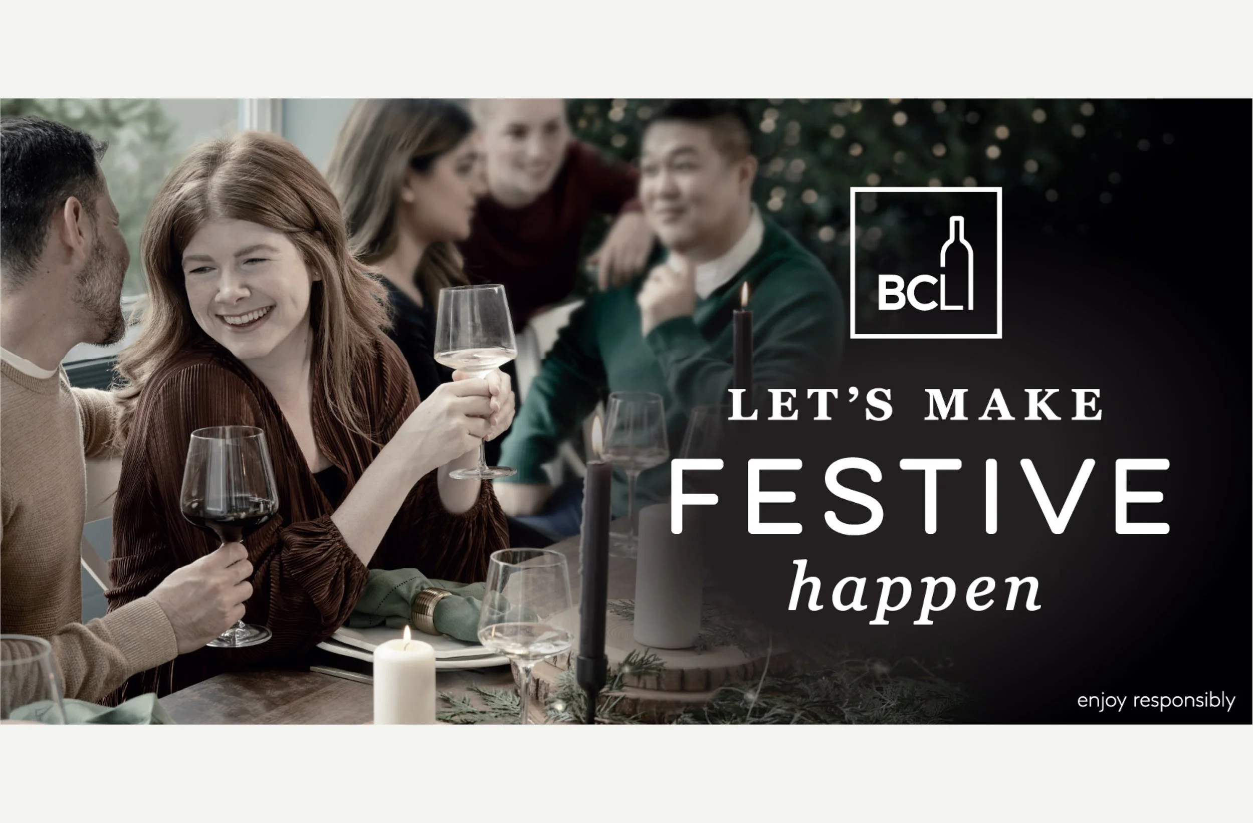
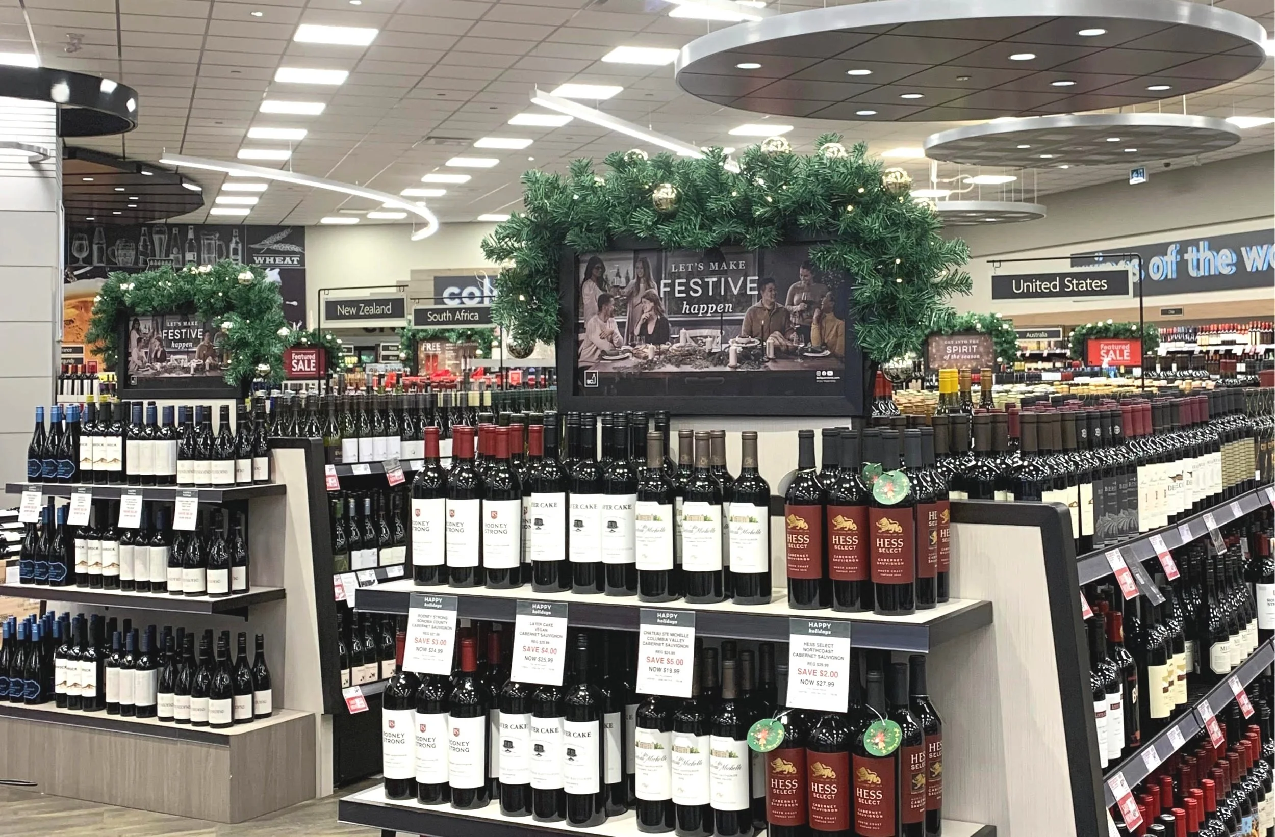
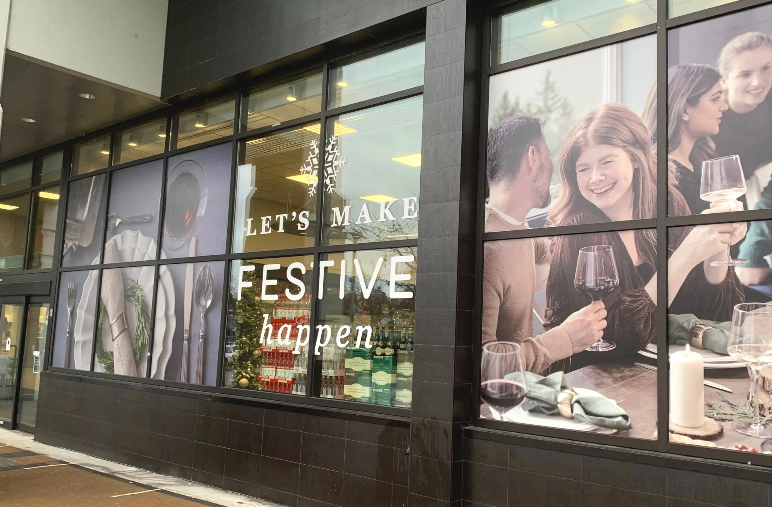
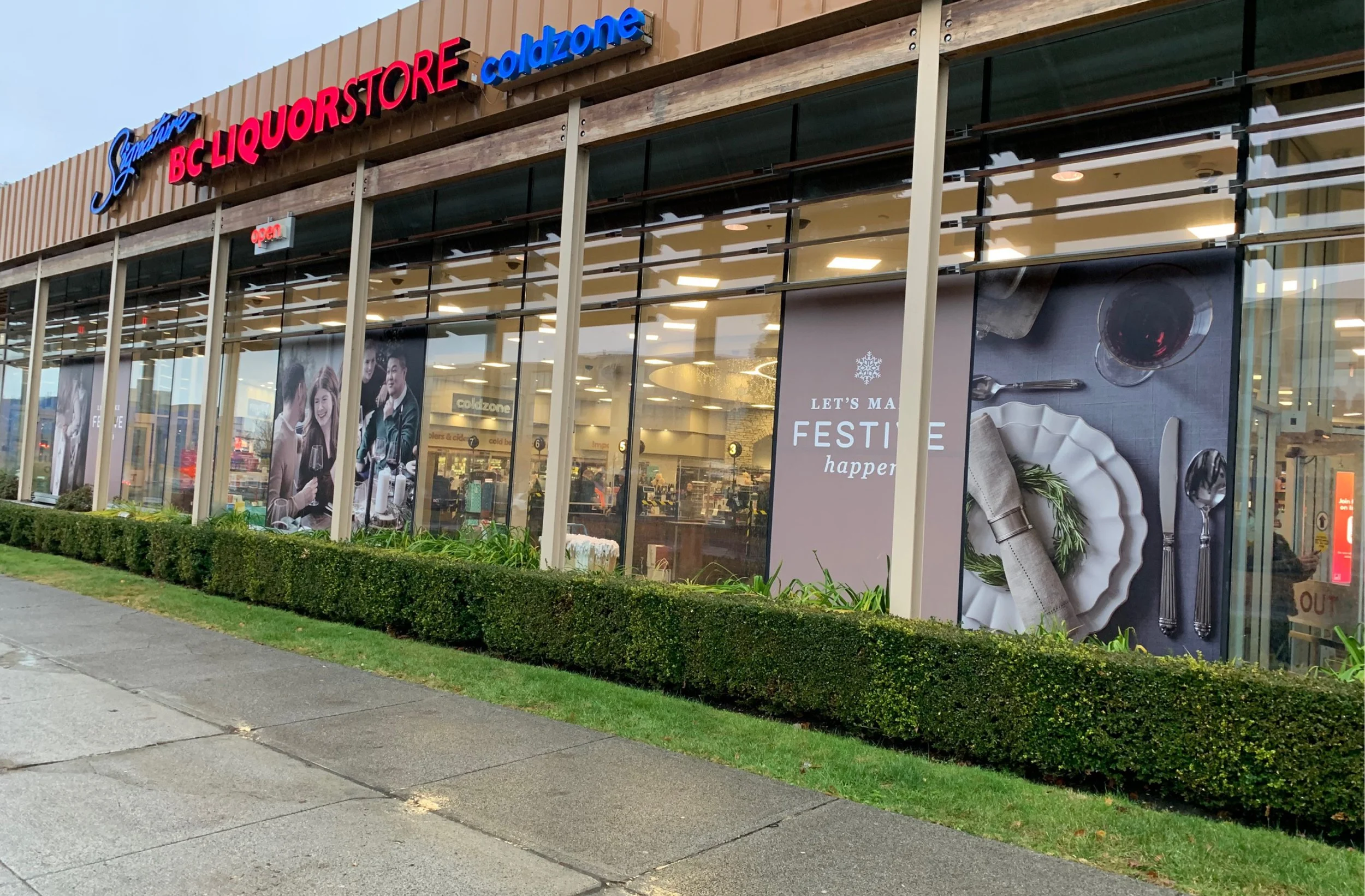
BCLIQUOR stores, set in communities across British Columbia, offer a wide range of alcoholic beverages in an approachable environment. Because the Holiday 2022 campaign was the first time families and friends could gather after two years of COVID-19 restrictions, I designed the campaign “Let’s make festive happen” to celebrate reunions and invite customers to ‘make the moment festive’.
Process
THE AESTHETIC
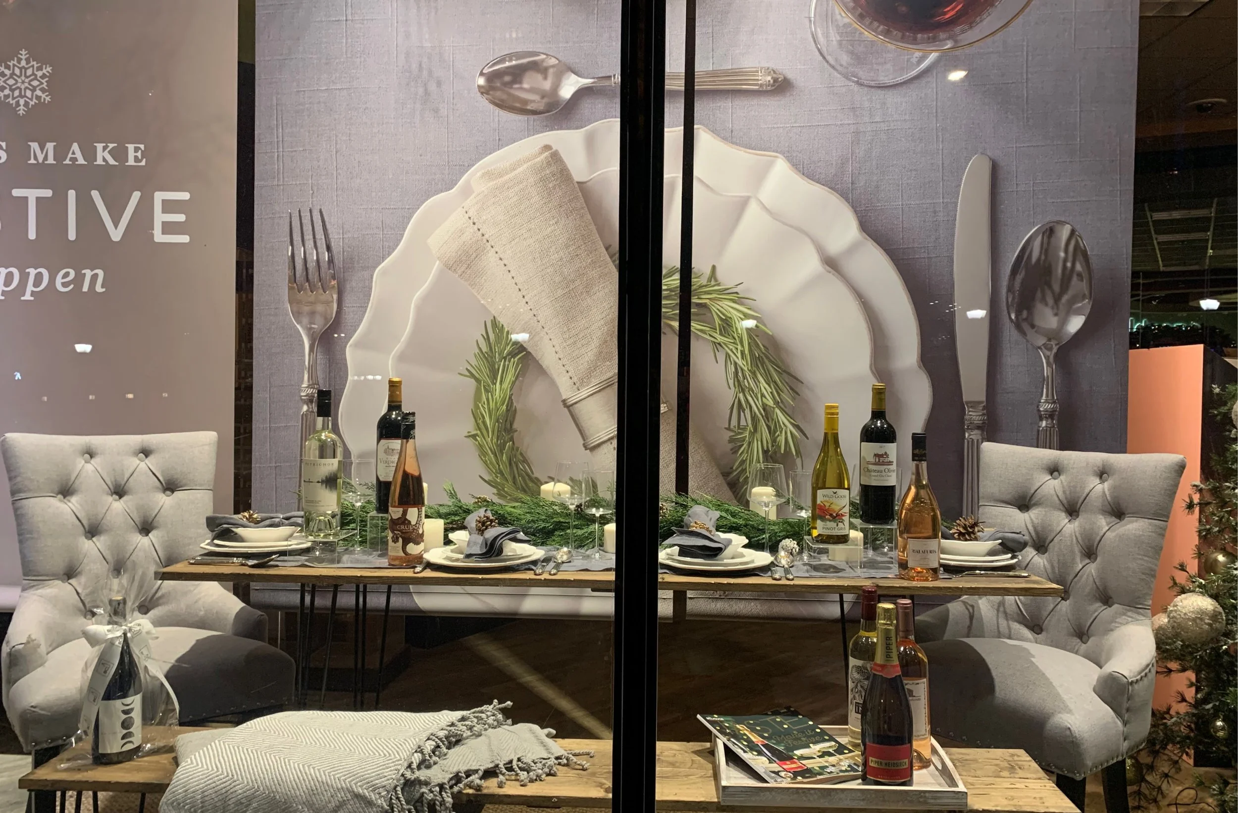
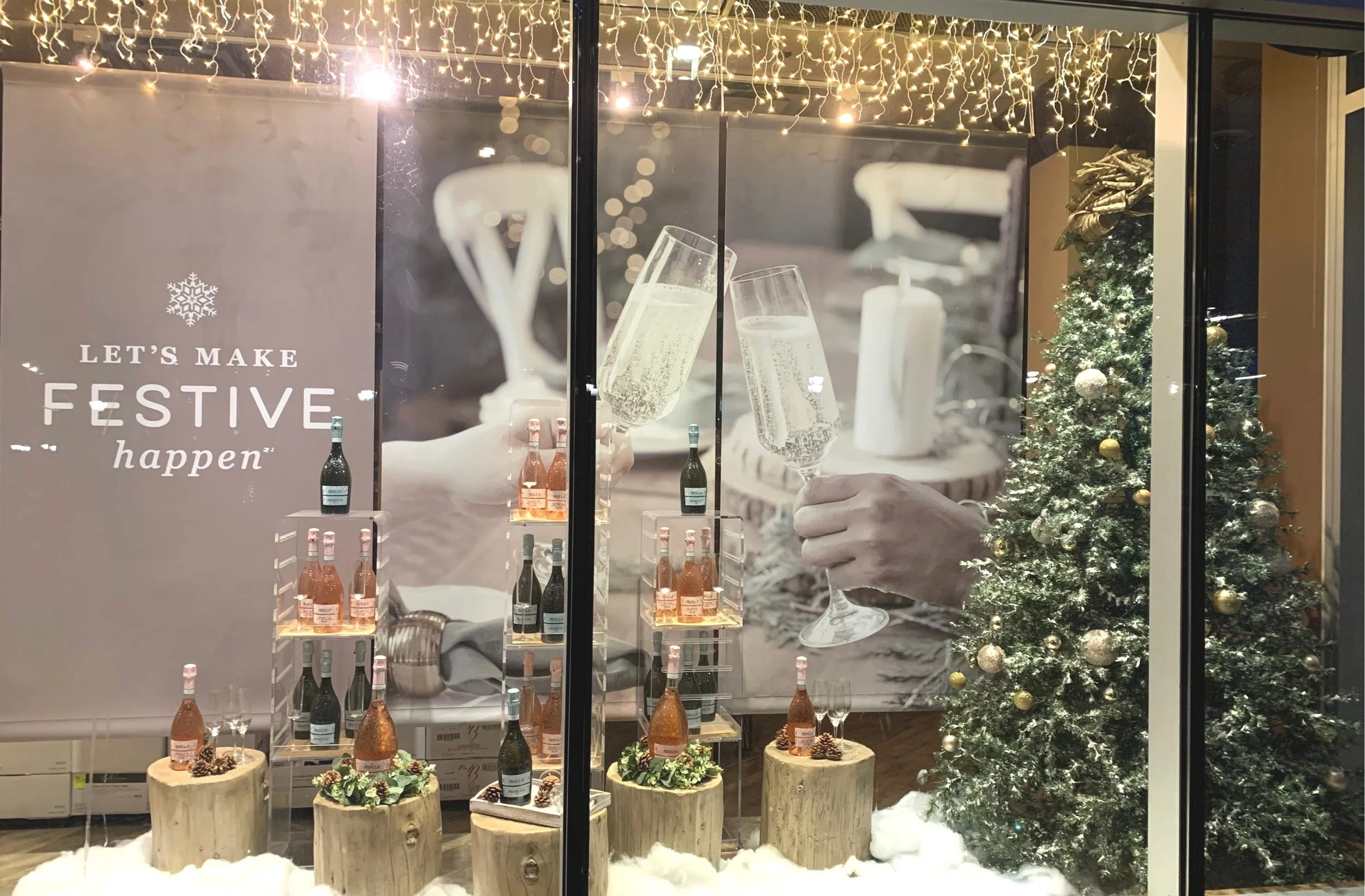
The campaign design takes inspiration from the ‘contemporary farmhouse’ aesthetic, which celebrates comfortable living, elegant natural tones and textures, high quality materials and nostalgic vintage pieces. This inspiration was derived from key themes presented by the BCLIQUOR in-house Visual Presentation (VP) team at project kick-off to work within existing interiors and the VP holiday décor to create a holistic customer experience.
DEVELOPING IMAGERY
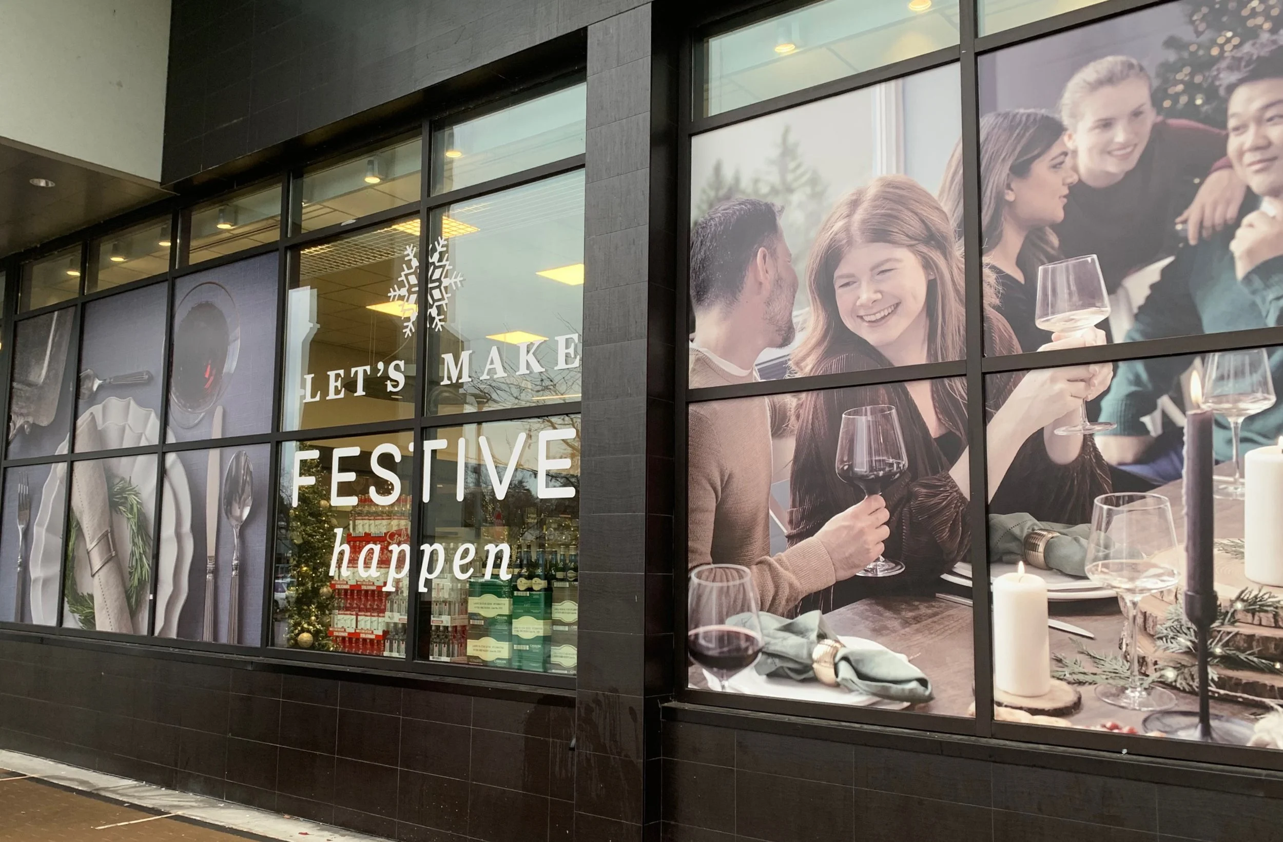
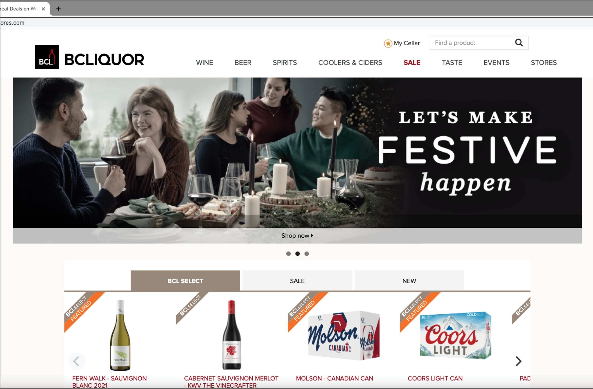
I wanted to promote the idea of casual-elegance and entertaining in a world that customers could envision themselves participating in or re-create at home. While it was a departure from previous BCLIQUOR holiday campaigns, in order to be more engaging to consumers, this project introduced highly narrative lifestyle imagery for its main theme.
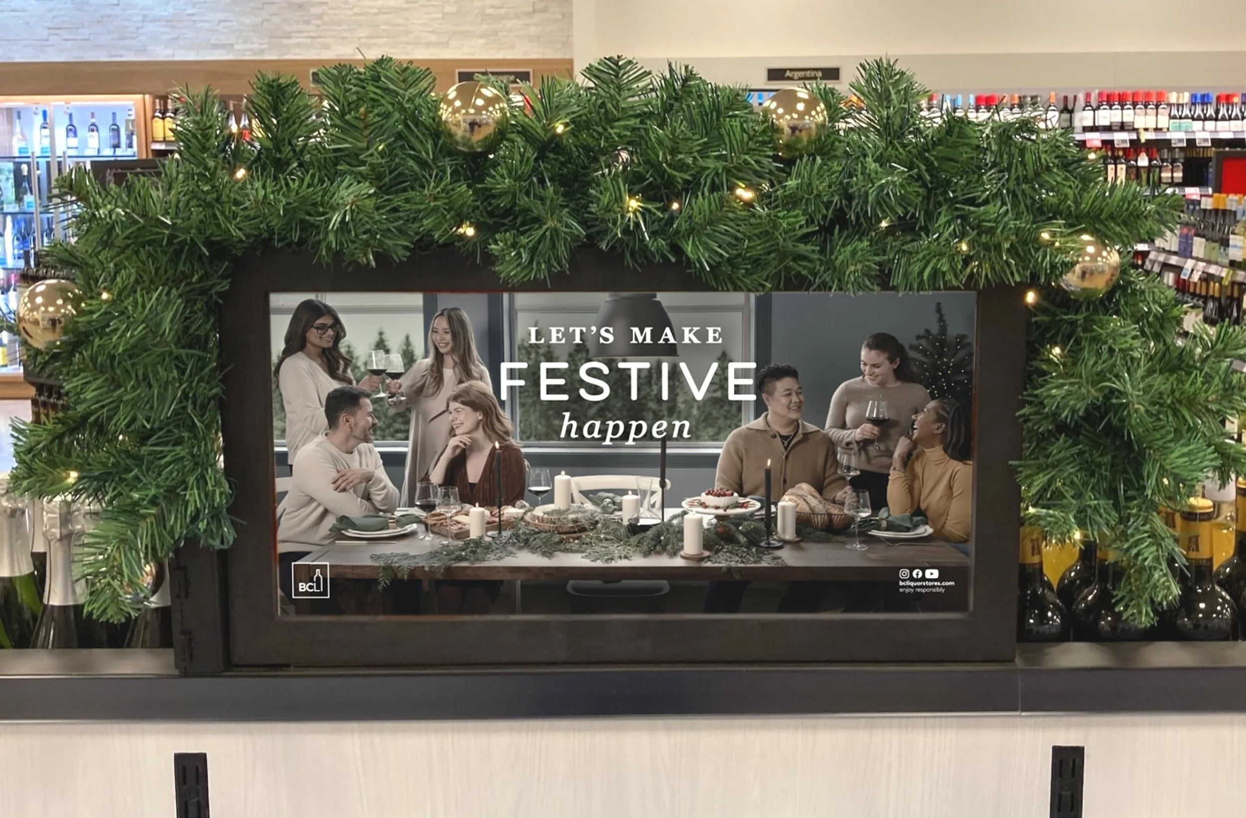
Under my creative direction, I planned a detailed shot list, including required staging, propping and image references. During the three-day shoot, I coordinated with an external photographer, makeup artist/stylist, and colleague, while also staging and propping the set to achieve the festive scenes, which varied from intimate vignettes to joyful groups being together.
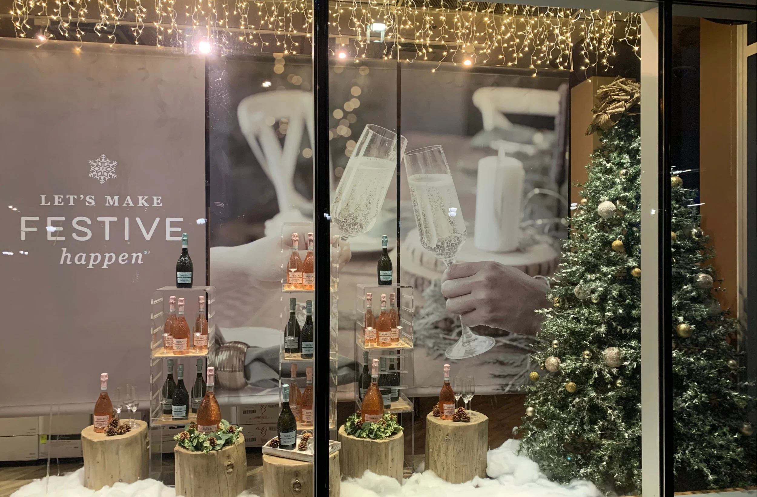
Details that support the casual-elegance of the ‘contemporary farmhouse’ vision included; natural evergreens and wood throughout, touches of contemporary metallic props mixed with traditional pieces, toned back colours, built up textures, including traditional chair rails and scrolled window casings and twinkle lights throughout to be festive.
COLOUR SCHEME
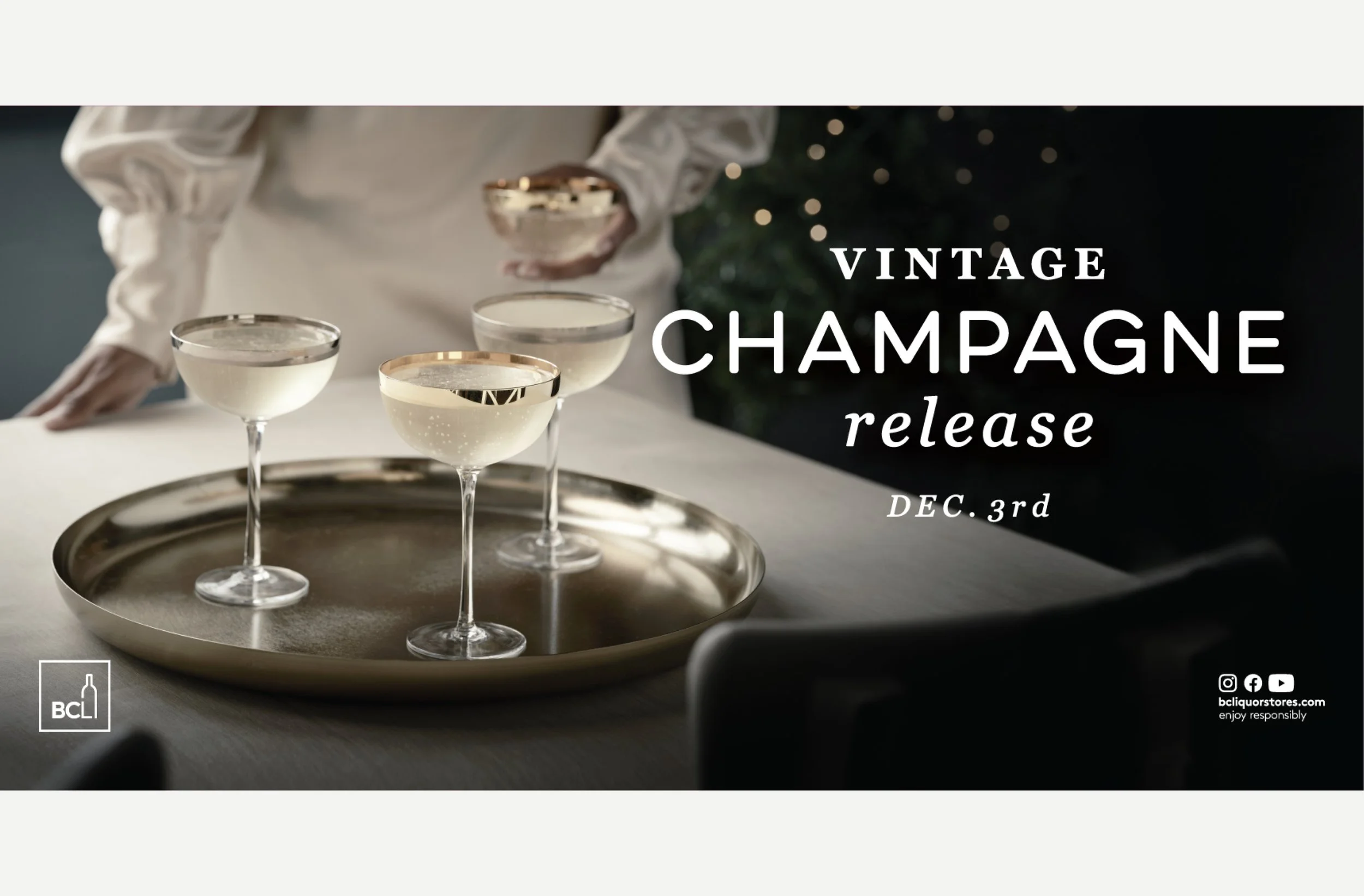
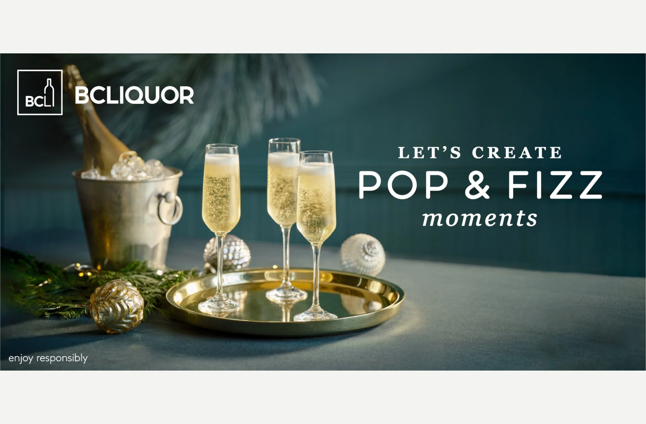
The core colour scheme is neutral (creams, blacks, browns) – I desaturated hues in lifestyle images to create a nostalgic/vintage charm.
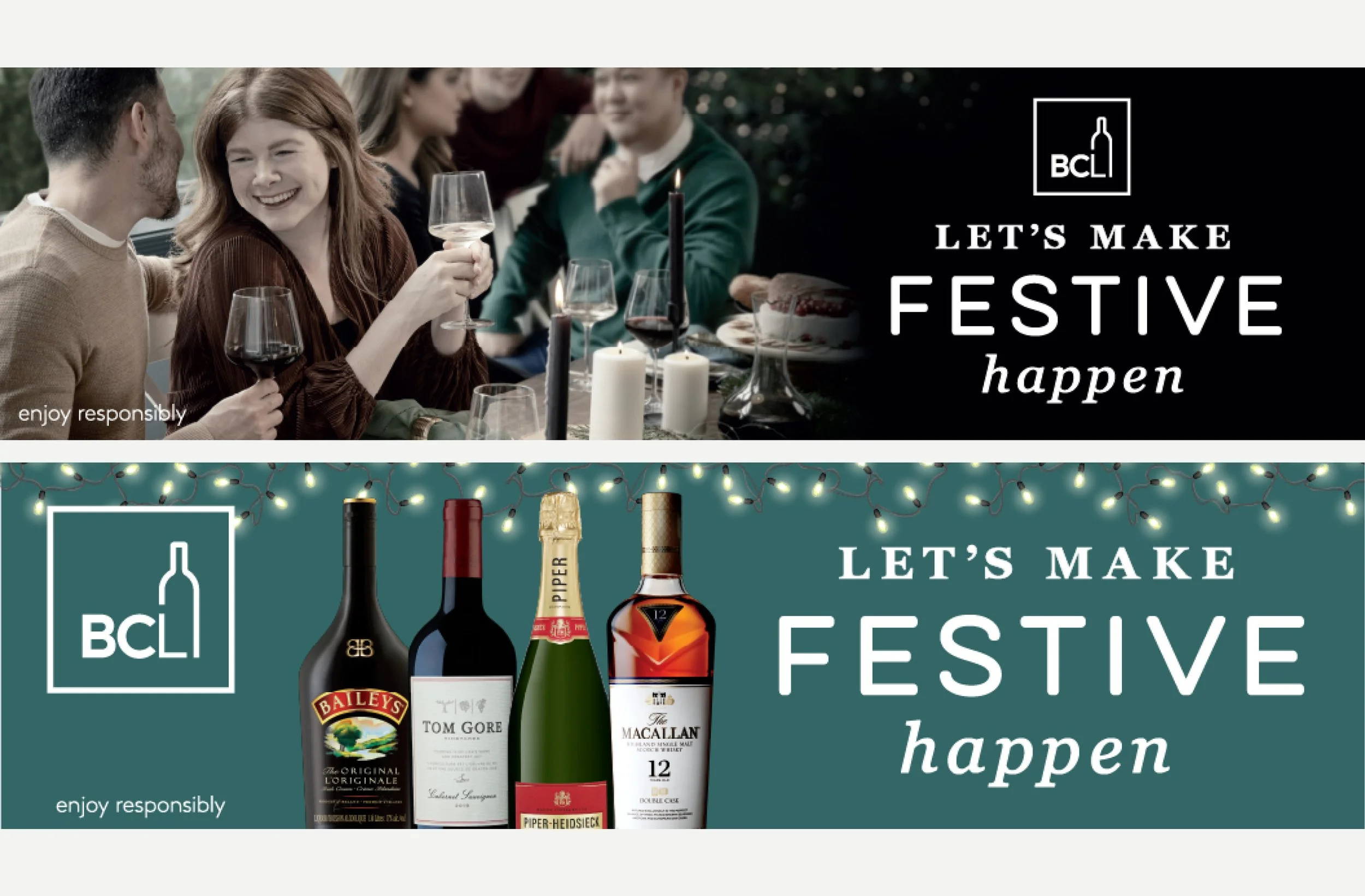
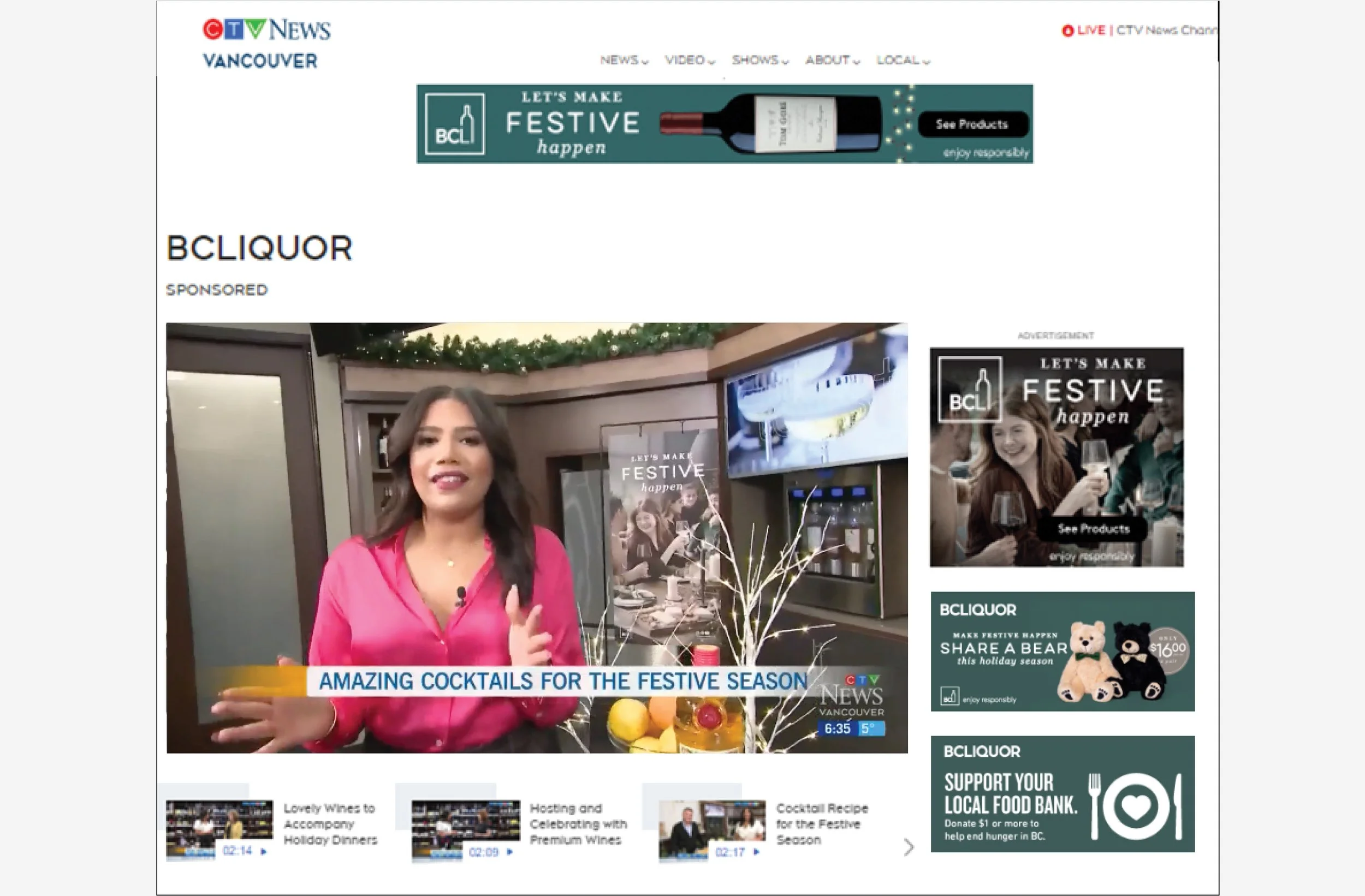
The addition of a few gemstone colours provided opportunity for pops of colour that offset the neutrals and create a celebratory feel. Advertising was tied together over multiple mediums/formats with a recognizable deep green that was initially used on set.
SLOGAN & TYPOGRAPHY
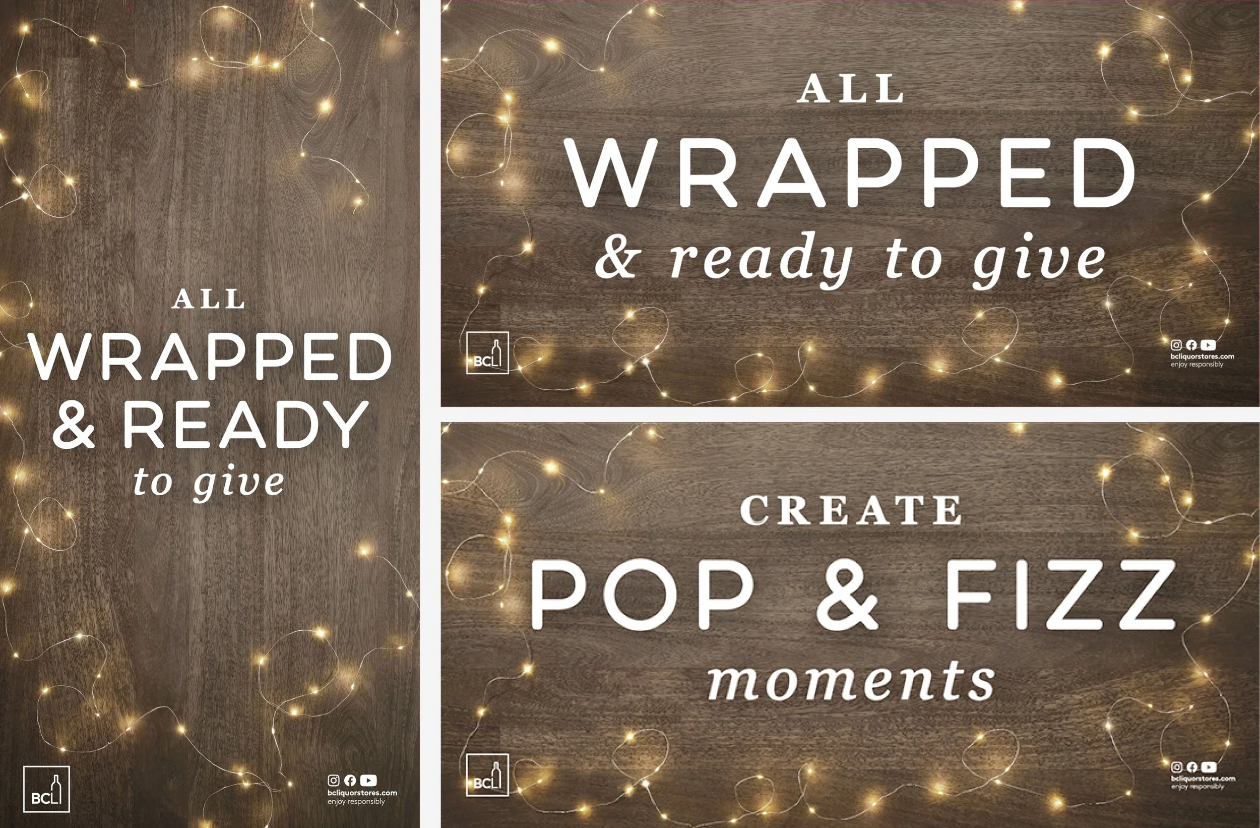
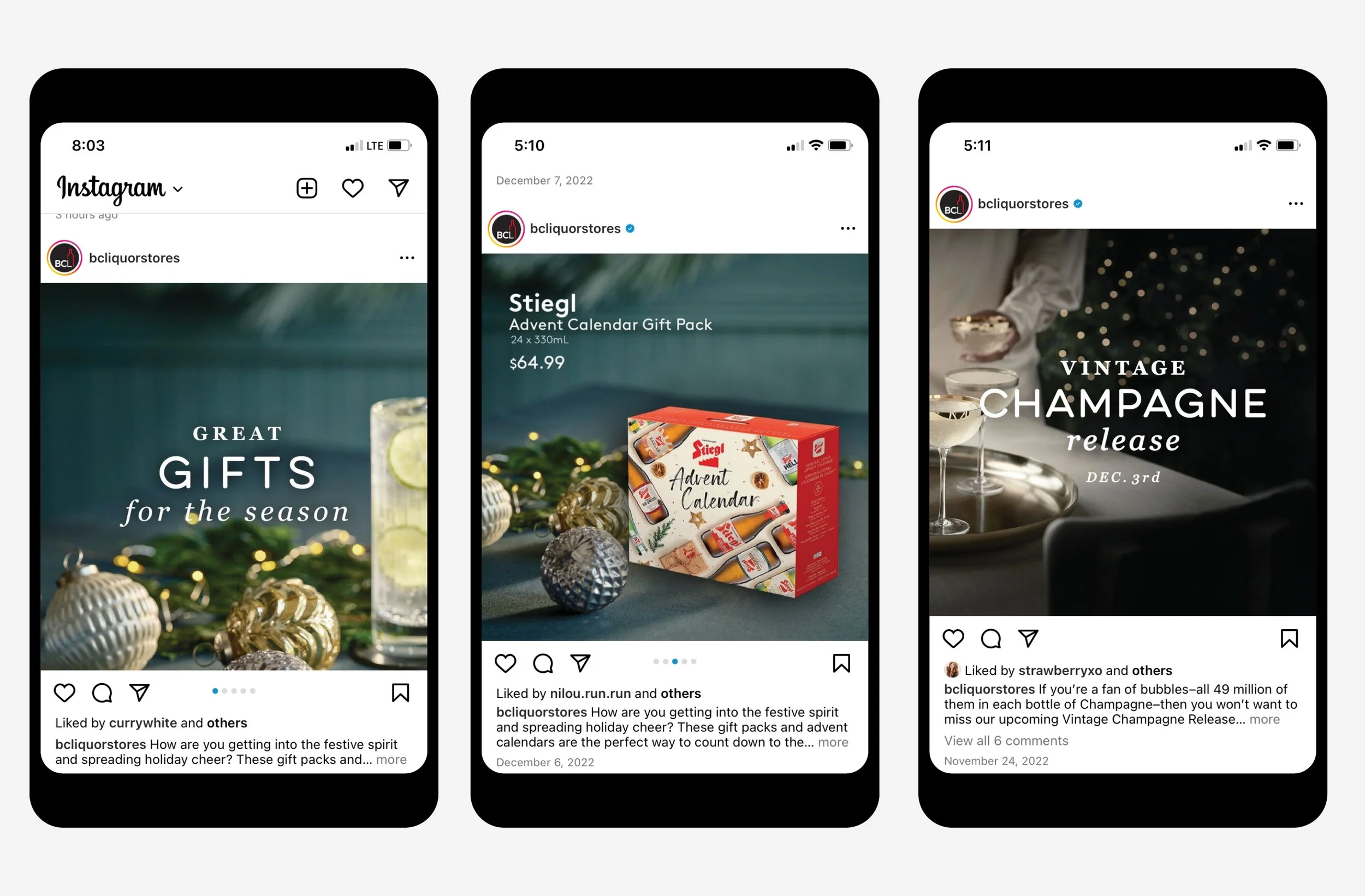
I ensured type compositions were visually interesting on their own, when used simply over a plain background, yet remained readable over imagery in print and online by carefully selecting and stacking mixed typefaces to add ‘texture’. The final composition is reminiscent of the elevated farmhouse aesthetic found in products and publications produced by companies that work within this ethos .
Eventually I landed on incorporating a ‘friendly’, wide, rounded sans/script, paired with an elegant but ‘sturdy’ serif that didn’t have too many fine details.
When applied to the final slogan the typography tells a story in and of itself.
Role: Art Direction, Lead Designer, Concept, Content Development, Production, Overseeing Team Production, Set Coordination, Propping, Staging and Wardrobe
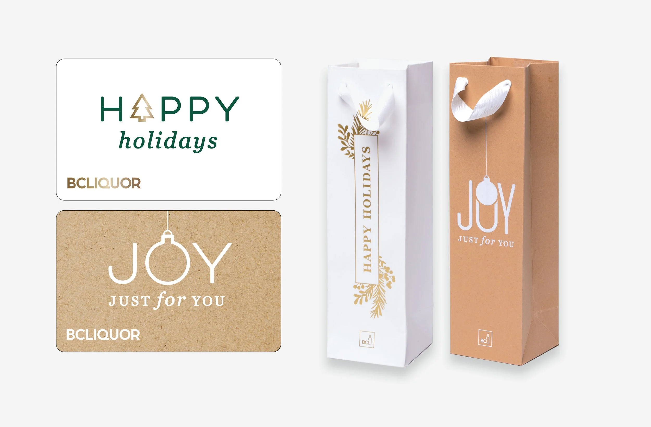
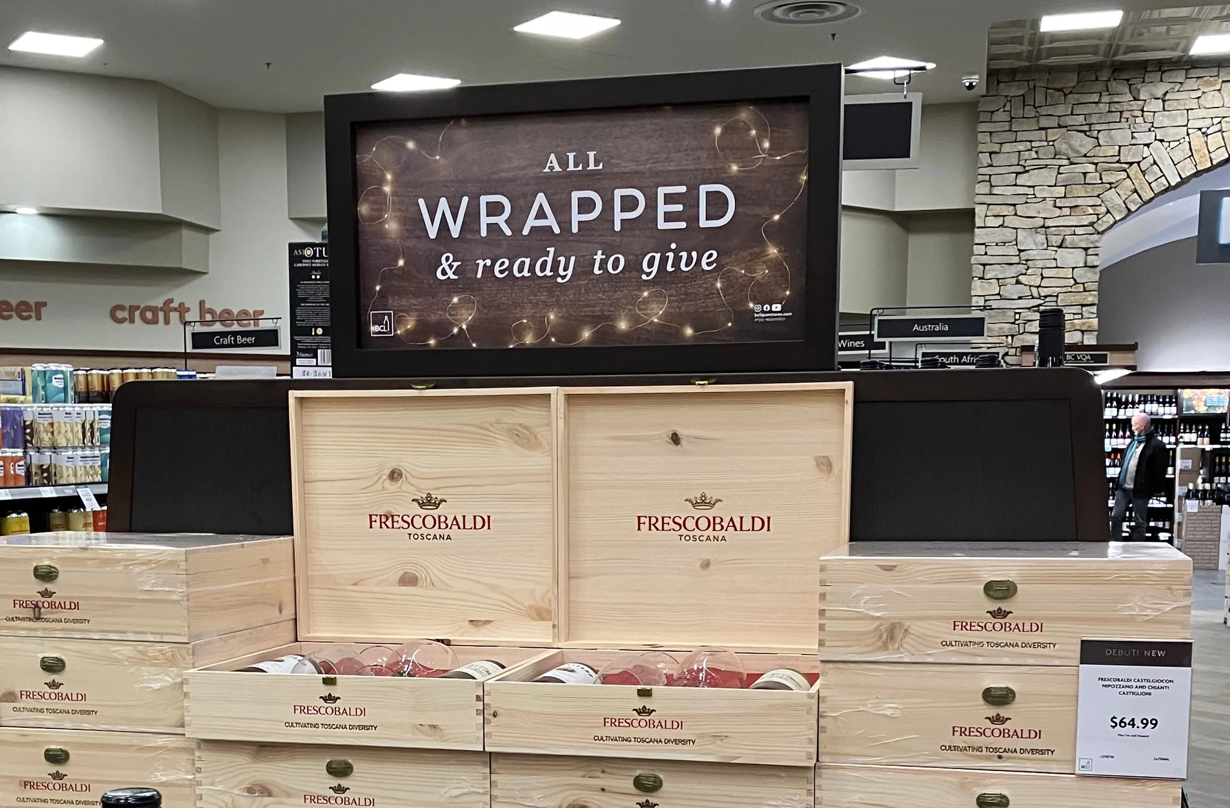
Project/Scope: In store collateral, consumables (gift cards and bags), large format display, advertising, retail website, social media.
Client: BCLIQUOR, BC Liquor Distribution Branch
Credit(s): BCLIQUOR (Marketing: Senior Brand Manager, Senior Graphic Designer, internal Designers, Visual Presentation, Digital & Advertising teams); Photography Joe Borrelli
